
Shopify Conversion Rate Optimisation, or CRO, is really just about understanding what makes your website visitors tick and using that knowledge to make it dead simple for them to buy from you. It’s a constant cycle of digging into your data, testing small changes, and tweaking your store based on real user behaviour to turn more window shoppers into loyal customers.
What Shopify CRO Actually Means for Your Store
Let’s cut through the jargon. When we talk to clients about Shopify conversion rate optimisation, we’re not pitching some massive, expensive redesign that’ll take months to complete. For us, it’s about making smart, data-backed improvements to your store’s user experience.
Think of it less as a huge one-off project and more as a continuous process of refinement. It’s about finding those tiny bits of friction—the little annoyances that stop a potential customer from clicking ‘Add to Cart’—and smoothing them out.
Often, the most powerful changes are the ones you wouldn’t even notice at first glance. We’ve seen that a slight tweak to a product filter, simplifying a checkout form, or even just changing the wording on a button can have a surprisingly big impact on your bottom line. The average conversion rate for a Shopify store hovers around 1.4%, but the top performers are hitting over 3.2%. Closing that gap is what CRO is all about.

Why Consistent Tweaks Beat Big Bang Redesigns
We’ve seen it time and time again. A store owner gets frustrated with their sales numbers and immediately jumps to the conclusion that they need a complete overhaul. While that’s sometimes true, this ‘big bang’ approach is risky, expensive, and often fails to address the real underlying issues.
Our philosophy is simple: sustainable growth comes from consistent, incremental improvements. By testing one change at a time, you learn exactly what resonates with your customers and what doesn’t.
This approach builds on itself. Each small win gives you fresh data and insights that inform your next test, creating a powerful feedback loop. Here’s why we champion this method with our clients:
- It’s Lower Risk: You’re not betting the farm on a single redesign. If a test doesn’t work out, you can easily switch it back and try something else without derailing your entire business.
- It’s Data-Driven: Every single decision is based on real user behaviour, not guesswork or just copying what a competitor is doing. This takes the emotion out of it and puts the focus squarely on what actually works for your audience.
- It Creates Lasting Impact: This isn’t about short-term tricks. It’s about fundamentally understanding your customers on a deeper level, which builds a stronger, more resilient business for the long haul in the competitive UK market.
Getting Started with the Right Mindset
Before you even think about tools and tactics, it’s vital to get your head in the right space. Effective Shopify CRO is a journey of continuous learning, not a one-off project you can tick off a list. It takes patience and a real commitment to getting comfortable with your analytics.
The goal is to stop making assumptions about your customers and start making decisions based on their actions. For a wider collection of ideas to improve your site’s performance, you might also find these general conversion rate optimization tips useful. In the next sections, we’ll show you exactly how we put this mindset into practice, starting with how to pinpoint where your customers are dropping off.
Finding Where Your Customers Are Dropping Off
Before you can fix the leaks in your sales funnel, you have to find them. Think of this as the detective phase of Shopify conversion rate optimisation. Instead of just guessing where the problems are, we need to dig into the data to see exactly where potential customers are getting stuck and bailing. It’s the first step we take on any client project, and frankly, it’s non-negotiable.
You can’t optimise what you don’t measure. Throwing random changes at your store and hoping something sticks is just a fast way to waste time and money. The goal here is to move from assumptions to informed decisions, using hard data to guide every single tweak and test you make.
Starting with the Right Tools
To get a clear picture of what your users are actually doing, you need the right tools in your toolkit. We’re not talking about a dozen complicated platforms; just two will get you most of the way there. When we kick off a project, our go-to combination is always Google Analytics and a heatmap tool.
- Google Analytics (GA4): This is your source of truth for quantitative data—the ‘what’ and ‘where’. It tells you what pages people are visiting and, crucially, where they are leaving your site. Don’t get overwhelmed by all the reports; we’ll focus on just a few key ones to get started.
- Heatmap Tools (like Hotjar or Microsoft Clarity): These tools give you the qualitative data—the ‘why’. They show you visually how users interact with your pages through click maps, scroll maps, and session recordings. It’s like looking over your customer’s shoulder as they browse your store.
This chart breaks down the journey: start with your current rate, use data to find the gaps, and then set a realistic target for improvement.
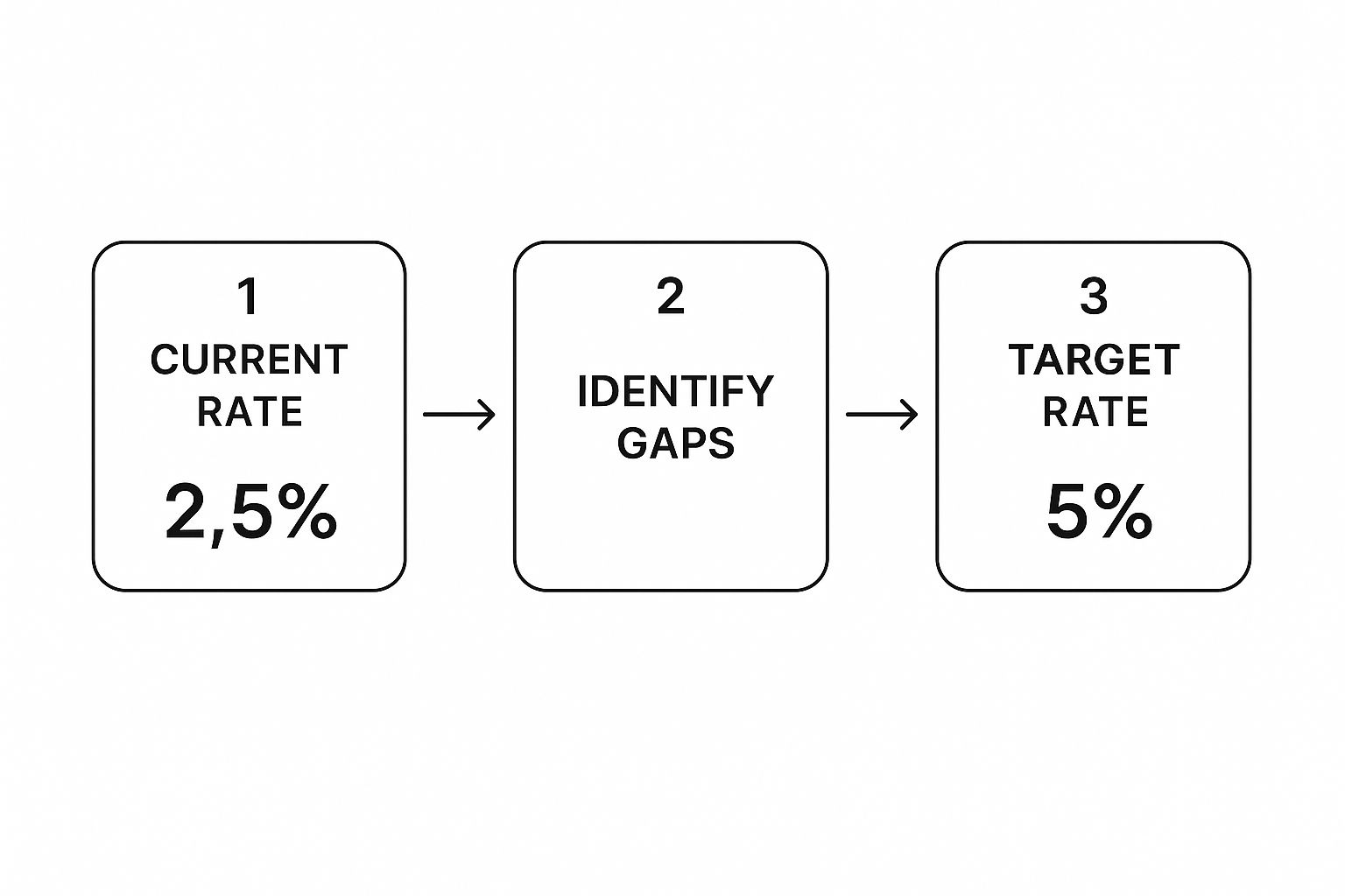
The key takeaway is that optimisation is a structured process, not a shot in the dark. It’s all about systematically bridging the gap between where you are now and where you want to be.
Analysing Your Sales Funnel
Your sales funnel is simply the path a visitor takes from landing on your site to completing a purchase. The most common journey on a Shopify store looks something like this: Homepage > Category Page > Product Page > Add to Cart > Checkout > Thank You Page.
Your mission, should you choose to accept it, is to find the biggest drop-offs between these stages.
We always tell our clients to focus on the biggest leaks first. Fixing a 5% drop-off from the homepage is good, but fixing a 50% drop-off between the cart and checkout is an absolute game-changer. That’s where you’ll get the quickest and most significant wins.
In Google Analytics 4, you can build a ‘Funnel exploration’ report to see this visually. You’ll instantly see the percentage of users who move from one step to the next and, more importantly, the percentage who don’t. Once you’ve pinpointed a leaky page, you can switch over to your heatmap tool to see why they might be leaving.
Common Drop-Off Points and Their Culprits
After working on countless Shopify stores over the years, we’ve seen the same issues crop up again and again. Once you know where your main drop-off is happening, check for these common culprits.
High Drop-Off on Product Pages?
If visitors are bouncing from your product pages without adding anything to their cart, it’s usually a sign of missing information or a lack of trust.
- Unclear Product Descriptions: Are your descriptions compelling? Do they answer key questions about size, materials, or what problem the product solves?
- Poor Quality Images: Low-resolution photos or not having enough angles can kill a sale instantly. People want to see what they’re buying.
- Hidden Shipping Costs: Surprise shipping fees are one of the top reasons for abandonment. Be upfront about delivery costs right on the product page.
- Missing Social Proof: A lack of reviews or testimonials can make a product feel risky to a new customer. Let them see others have bought and loved it.
For a deeper dive, this ultimate guide to product page optimization for higher conversions is packed with invaluable strategies.
High Drop-Off at Checkout?
Losing customers at the final hurdle is painful. This part of the funnel needs to be as smooth and frictionless as possible.
- Forcing Account Creation: Don’t put a barrier in front of the finish line. Always, always offer a guest checkout option.
- A Long, Complicated Form: Only ask for the information you absolutely need to fulfil the order. The fewer fields, the better.
- Lack of Payment Options: People have their preferred ways to pay. Not offering options like PayPal, Apple Pay, or Klarna can be a deal-breaker for many.
By systematically finding these drop-off points and investigating the likely causes, you create a prioritised list of data-backed ideas to test. This is the foundation of any successful Shopify conversion rate optimisation strategy.
Key Shopify Analytics Metrics to Diagnose Conversion Issues
To get a bit more granular, you need to know which numbers to watch in your analytics dashboard. Here are the metrics we always start with to diagnose where things are going wrong.
| Metric | What It Tells You | Sign of a Problem |
|---|---|---|
| Add to Cart Rate | The percentage of visitors who add at least one item to their cart. | A low rate (e.g., under 3-4%) suggests issues with product pages. |
| Reached Checkout Rate | The percentage of visitors who start the checkout process after adding items to their cart. | A significant drop from ‘Add to Cart’ points to friction in the cart itself. |
| Sessions to Purchase | The average number of sessions it takes for a visitor to make a purchase. | A high number could mean your site is confusing or lacks urgency. |
| Average Order Value (AOV) | The average amount a customer spends per order. | A low AOV might indicate you’re not upselling or cross-selling effectively. |
| Bounce Rate (by page) | The percentage of visitors who leave after viewing only one page. | High bounce on key pages (product, category) means they aren’t engaging. |
| Site Speed / Page Load Time | How quickly your pages load for users. | Anything over 3 seconds is a major conversion killer. People won’t wait. |
Looking at these metrics in combination gives you a powerful diagnostic tool. A low ‘Add to Cart’ rate combined with a high bounce rate on product pages, for example, is a massive red flag telling you exactly where to focus your attention first.
Optimising for Speed and the Mobile Experience
Let’s get straight to it: if your Shopify store is slow, you’re losing money. It’s really that simple. In all our years of doing Shopify conversion rate optimisation, we consistently see site performance as the lowest-hanging fruit for a quick, impactful win. Customers have zero patience for a sluggish website, especially on mobile.
A slow site feels untrustworthy and frustrating, sending potential buyers straight to your faster competitors. Research has shown that even a one-second delay in mobile page load times can hit conversion rates by up to 20%. That’s a massive chunk of revenue disappearing before a customer has even seen your products properly.

Decoding the Tech Jargon
When you start digging into site speed, you’ll bump into a few acronyms from Google called Core Web Vitals. They sound technical, but the concepts are actually pretty straightforward and all about user experience.
Here’s our quick, no-fluff breakdown:
- Largest Contentful Paint (LCP): This is just a fancy way of asking, “How long does it take for the most important bit of your page to show up?” On a product page, this is usually the main product image or the title. You want this to be lightning fast—ideally under 2.5 seconds—so the user instantly sees what they came for.
- Cumulative Layout Shift (CLS): Ever tried to click a button, only for the page to jump and you end up tapping something else? That annoying shift is CLS. It measures how much your page content moves around as it loads. A low CLS score means your site is stable and doesn’t feel broken.
You can check these scores for your own store using Google’s PageSpeed Insights tool. Just pop in your URL, and it’ll give you a report for both mobile and desktop. Don’t panic if your scores are low; just see it as a clear roadmap for improvement.
Our Go-To Methods for Speeding Up a Store
When a client comes to us with a slow store, we have a checklist of usual suspects we investigate first. These are the areas that almost always offer a chance to make significant gains in speed.
First up, images. They are often the single biggest culprit for slow load times. We always run a client’s images through a compression tool like TinyPNG. It can slash file sizes by over 70% without any noticeable drop in quality. We also make sure images are served in next-gen formats like WebP, which Shopify now handles automatically in many cases.
Next, we look at the apps. Shopify apps are brilliant, but some are coded poorly and add a lot of “bloat” to your site, dragging it down. We carry out an app audit, identify which ones are loading unnecessary code, and find lighter, more efficient alternatives. Always ask yourself: is this app really essential to my customer’s journey?
A real-world example of this in action is the Shopify store The Sunday Citizen. They achieved a remarkable 6% increase in conversions after optimising their website speed by focusing on better image delivery and simplifying their site layout. This led to a 25% improvement in LCP and a massive 61% reduction in CLS, directly contributing to a lower bounce rate.
Making Mobile Your Priority
Most of your traffic is probably coming from mobile devices. If your store isn’t built with a “mobile-first” mindset, you’re already behind. This means designing the experience for the small screen first, then adapting it for desktop—not the other way around.
A brilliant mobile experience is all about simplicity and ease of use.
- Thumb-Friendly Design: Make sure your buttons and links are large enough to be tapped easily without zooming. Key calls-to-action, like ‘Add to Cart’, should be impossible to miss.
- Simplified Navigation: A huge, complex menu is a nightmare on mobile. Use a clean “hamburger” menu and prioritise your most important categories.
- Streamlined Forms: Nobody wants to type their life story on a tiny keyboard. Cut down your checkout and contact forms to only the absolute essentials.
Ultimately, a great mobile experience is intuitive. Your visitors shouldn’t have to think about how to find something or make a purchase. If you’re looking for more inspiration on this, we’ve written a guide covering some of the most important e-commerce UX and UI trends to watch that are shaping mobile design. Speed and mobile usability are two sides of the same coin, and getting both right is a foundational step in any solid Shopify conversion rate optimisation strategy.
Creating a Seamless and Trustworthy Checkout
You’ve put in the hard work. You’ve polished your product pages, boosted your site speed, and successfully guided a customer all the way to your checkout. This is the final step, the moment of truth—so let’s make sure you don’t drop the ball now.
Cart abandonment is the bane of every ecommerce owner’s existence. It’s that gut-wrenching moment when a near-certain sale simply vanishes into thin air. More often than not, the culprit is a clunky, confusing, or untrustworthy checkout process.
When we work with clients on their Shopify conversion rate optimisation, this is one of the first areas we examine for quick wins. A few intelligent tweaks here can have a huge impact on your bottom line, turning those abandoned carts into completed orders.
Make Paying as Easy as Possible
Think about the last time you bought something online. Did you have to fish out your card and manually punch in your 16-digit number, expiry date, and address? Or did you just tap a button and use your fingerprint? The difference in effort is massive, and your customers feel it too.
Friction is your number one enemy at the checkout. The goal is to make the entire payment process so smooth and effortless that the customer sails right through without a second thought.
The single best way to slash friction is by enabling express payment options. We’re talking about Shop Pay, Apple Pay, and Google Pay. These one-click wonders completely remove the tedious chore of filling out forms, which is a major reason people give up and leave.
This isn’t just a nice feature to have anymore; it’s a core expectation for modern online shoppers. If you haven’t enabled these in your Shopify settings yet, we’d suggest making it your top priority after you finish reading this.
Simplify Your Forms Relentlessly
Every single field you ask a customer to fill in is another tiny reason for them to quit. Do you really need their phone number if you have no intention of calling them? Is that second address line truly essential?
We always advise our clients to strip their checkout forms back to the absolute bare minimum. Just stick to what you need to process the payment and ship the product. Nothing more. This is especially important on mobile, where tapping away on a small screen is a genuine pain point.
The average cart abandonment rate across e-commerce is hovering around 70%. However, UK Shopify merchants who have streamlined their checkout by minimising form fields and enabling one-click payment options have seen notable gains in their conversion rates. To see more detailed benchmarks, you can discover more insights about e-commerce conversion rates on blendcommerce.com.
Build Trust When It Matters Most
The moment a customer is about to enter their card details, their brain goes on high alert for anything that looks even slightly dodgy. This is the final step where trust is either cemented or completely shattered.
You need to give them visual reassurance that their details are safe and that your business is legitimate. Here’s a quick checklist of trust signals we always recommend adding to the checkout page:
- Trust Badges: Display logos of well-known payment providers like Visa, Mastercard, and PayPal. An SSL secure badge is also non-negotiable.
- Clear Returns Policy: Link to your returns policy somewhere prominent. Knowing they can easily send an item back if it’s not right reduces the perceived risk of making the purchase.
- Customer Support Info: Make it obvious how they can contact you. A simple email address or a link to your contact page shows you’re a real business ready to help.
These small visual cues have a powerful psychological effect. They calm those last-minute nerves and help push the customer over the finish line.
Offer Flexible Payment Options
Sometimes, the final hurdle isn’t friction or trust—it’s the price tag. For bigger purchases, customers can hesitate, even when they love the product. This is where “Buy Now, Pay Later” (BNPL) services come into play.
Integrating options like Klarna or Clearpay can be a game-changer, especially for stores with a higher average order value. They break down what might be an intimidating lump sum into smaller, interest-free instalments, which makes the purchase feel far more manageable.
By showing customers they can get the product now and spread the cost, you remove that final moment of financial hesitation. It’s another powerful tool in your Shopify conversion rate optimisation arsenal. And if you’re looking to recover those who still hesitate, our guide on using Klaviyo for abandoned cart recovery can help you bring them back.
Using Social Proof to Build Long-Term Trust
Proper Shopify conversion rate optimisation goes way beyond just chasing that initial sale. It’s about building a brand people genuinely trust, a brand they want to come back to again and again. This is where we get into the softer side of optimisation—the stuff that builds real, long-term value and turns one-time buyers into loyal fans.
We see it all the time: stores think they’ve ticked the social proof box just by slapping a basic five-star rating system on their product pages. But real trust runs much deeper. It’s about showing potential buyers, in an authentic way, that real people just like them are buying and absolutely loving your products.

Moving Beyond Simple Star Ratings
Look, star ratings are a decent starting point, but they’re just that—a start. Today’s shoppers, especially here in the UK, are savvy. They want more context. They need to see themselves in the reviews to feel confident that the product is right for them. This is where richer, more convincing forms of social proof come into play.
When we’re working with a client, we always push them to gather and showcase more authentic content. Here are the types of social proof that we’ve seen deliver the biggest impact, time and time again:
- Customer Reviews with Photos: This is massive. A text review is one thing, but a photo of a real customer using and enjoying your product? That’s gold. It provides visual proof that your stuff looks just as good in real life as it does in your slick, professional product shots.
- User-Generated Content (UGC): Get your customers to share photos of their purchases on Instagram and TikTok with a unique hashtag. You can then pull these images into a gallery on your product pages. It’s authentic, it’s free marketing, and it builds a powerful sense of community around your brand.
- Press Mentions and Expert Endorsements: If your brand has been featured in a well-known publication or praised by an industry expert, you need to be shouting about it. Displaying logos from reputable sources on your homepage adds a layer of credibility that’s incredibly difficult to build on your own.
We often tell our clients to think of social proof as a conversation. A star rating is a whisper, but a detailed review with a customer photo is a confident recommendation from a trusted friend. Your job is to make that conversation as loud and clear as possible.
The Power of Post-Purchase Communication
Getting the sale is only half the battle. The real magic, the stuff that builds a sustainable business, happens after the checkout. Your post-purchase email sequence is one of the most underrated assets you have for boosting customer lifetime value.
This isn’t about spamming people with endless discounts. It’s about continuing the positive experience they just had, building a genuine relationship, and making them feel truly valued. This is how you create a community, not just a customer list.
Essential Email Flows for Loyal Fans
If you do nothing else, setting up a few simple, automated email flows can completely transform your post-purchase strategy. These are the sequences we believe every single Shopify store should have in place to turn new buyers into repeat customers.
The “Thank You & Welcome” Sequence
This is your first impression after the sale, so you’ve got to make it count.
- Instant Order Confirmation: This is a given, but double-check that it’s crystal clear and reassuring.
- A Personal Thank You: A day or two later, send an email from the founder. Share a bit of your brand story and thank them for joining the community. No selling, just genuine appreciation.
- Product Care/Usage Tips: Help them get the most out of their purchase. If they bought a skincare product, send a guide on how to incorporate it into their routine. This shows you care about their experience, not just their wallet.
The “Review Request” Flow
Timing is absolutely everything here. You want to ask for that review when their excitement is at its peak.
- Trigger the request a set number of days after the order is delivered, not shipped. For UK deliveries, 7-10 days is usually the sweet spot.
- Make it easy. Link them straight to the product page and consider incentivising them for leaving a photo review. A small discount on their next purchase works wonders.
These simple flows are foundational to good Shopify conversion rate optimisation because they’re all about retention. Remember, acquiring a new customer can cost five times more than keeping an existing one. By investing in the post-purchase experience, you’re not just building trust—you’re making a savvy financial decision that will pay dividends for years to come.
Your Shopify CRO Questions Answered
Over the years, we’ve handled hundreds of questions about boosting conversions. It’s totally normal to feel a bit stuck or wonder if you’re focusing on the right things.
So, we’ve gathered the most common questions we get from UK Shopify store owners to give you some clear, no-nonsense answers based on our hands-on experience.
What Is a Good Shopify Conversion Rate?
Honestly, this is the million-dollar question. While industry reports often throw around an average of 2.5% to 3%, data specifically for Shopify stores suggests the average is closer to 1.4%. If your store is converting above 3.2%, you’re in the top 20% of Shopify stores, which is brilliant.
But here’s how we see it: a “good” conversion rate is one that’s better than last month’s. It’s less about chasing a magic number and more about continuous improvement.
A store selling £50 T-shirts will naturally have a higher conversion rate than one selling £2,000 bespoke furniture, so context is everything. Focus on your own progress, not just industry averages.
How Often Should I Be Running Tests?
This is a great question because it gets to the heart of what consistent Shopify conversion rate optimisation is all about. There’s no single right answer, as it really depends on your store’s traffic.
If you have a high-traffic store (think thousands of visitors a day), you can get statistically significant results from A/B tests in just a few days. For these clients, we might be running tests constantly.
For most stores, though, a more realistic and manageable pace is to aim for one or two meaningful tests per month. This gives you enough time to form a solid hypothesis based on your data, build the test properly, let it run long enough to get reliable results, and then analyse what you’ve learned. The key is consistency, not volume.
Can I Do CRO Myself or Do I Need an Agency?
You can absolutely get started with CRO yourself, and we encourage it! Using the tools and strategies we’ve discussed in this guide—like analysing your data in Google Analytics, watching session recordings in Hotjar, and making common-sense improvements—will get you a long way.
Where an agency like ours comes in is when you hit a plateau or want to tackle more complex challenges. We can bring a fresh pair of eyes, deeper technical expertise for things like advanced A/B testing and site speed, and years of experience from seeing what works across dozens of different stores.
Think of it like this: you can service your own car to keep it running well, but for a major engine rebuild, you’d probably call a specialist. Start with the basics, and if you find you’re not getting the results you want or you’re ready to scale faster, that’s the perfect time to think about bringing in an expert team.
At Digital Fresh, we live and breathe Shopify. If you’re ready to turn more of your visitors into loyal customers and take the guesswork out of your growth, we’re here to help. Learn more about how our expert team can help you scale your Shopify store.