
Ever feel like your Shopify store is a busy high street with loads of people looking but not enough buying? You’re not alone. Getting traffic is one thing, but turning those visitors into actual, paying customers is the real game. That’s where Conversion Rate Optimisation, or CRO, comes in. Think of it as the art and science of making your online shop more persuasive and easier to use. It’s all about understanding what your customers do and removing any roadblocks that stop them from hitting that all-important “buy now” button.
Here at our agency, we’ve spent years in the trenches, tweaking, testing, and optimising Shopify stores just like yours. We’re not about vague theories; we focus on what gets results. This article pulls back the curtain on 8 real-world conversion rate optimisation examples that have delivered proper success. We’ll break down the specific challenge each store faced, the exact changes we implemented, and the impact it had on their bottom line.
Forget the guesswork. To effectively turn clicks into customers, you need to understand the proven ways to improve website conversions and use data to make smart moves. We’ll show you exactly how to do that with practical, battle-tested tactics you can start thinking about for your own store today.
1. A/B Testing Headlines and Copy
At its core, A/B testing is a beautifully simple concept: you create two versions of something on a page (like a headline), show them to two similar groups of visitors, and see which one performs better. It’s one of the most fundamental conversion rate optimisation examples because your headline is often the first thing a potential customer reads. Get it wrong, and they’re gone.
A/B testing, or split testing as it’s also known, takes the guesswork out of the equation. Instead of going with a gut feeling, you use real data to find out what messaging actually connects with your audience. We’ve found this methodical approach is crucial for understanding user behaviour and making small improvements that add up to big wins over time.
The Strategy in Action
Think of your headline as your ultimate sales pitch. Does it shout about a clear benefit, or just list a feature? A classic example is from a company called Basecamp. They found their sign-ups jumped by over 30% just by changing their headline from being feature-focused to benefit-led. It’s a perfect illustration of how small copy changes can have a massive impact.
How We Implement This for Shopify Stores
When we work with a client, we don’t just test random ideas. We start by pinpointing the most important pages, like the homepage or key product pages.
- Hypothesis First: We always start with a clear “what if”. For example: “We believe that changing the headline from ‘Durable Dog Toys’ to ‘Indestructible Fun for Your Dog’ will increase add-to-cart clicks because it focuses on the emotional benefit for the dog owner.”
- One Change at a Time: It’s tempting to change everything at once, but we only test the headline to make sure we know exactly what caused the change in results.
- Patience is Key: We let the test run long enough to get a reliable result. This ensures the outcome isn’t just a fluke.
The following bar chart visualises the powerful lift seen in classic A/B testing case studies.
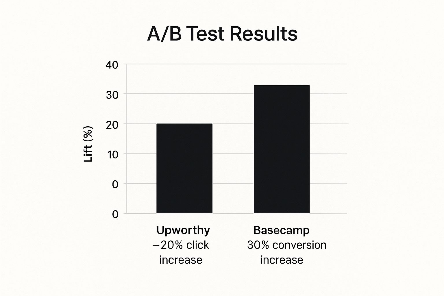
The chart clearly shows that significant conversion increases are achievable by focusing on targeted copy improvements.
2. Button Colour and Design Optimisation
It might sound trivial, but the colour, size, and text of your call-to-action (CTA) buttons can have a dramatic impact on your conversion rates. This isn’t about picking your favourite colour; it’s about using visual cues and a bit of psychology to guide a user’s eye and encourage that click. It’s one of the classic conversion rate optimisation examples because CTAs are the final gateway to a sale.

The goal is to make your most important buttons, like “Add to Cart” or “Buy Now,” impossible to miss. We often find a high-contrast colour that stands out from the brand’s main palette works best, creating a visual pop that draws immediate attention. This simple tweak makes the next step in the buying journey obvious for your customer.
The Strategy in Action
This is a well-trodden path for a reason. HubSpot famously ran a test where a red CTA button outperformed a green one by 21%, blowing up the common assumption that green always means ‘go’. There’s no single “best” colour. Success depends entirely on your site’s design, your audience, and creating a strong contrast that makes the button stand out.
How We Implement This for Shopify Stores
When we tackle CTA optimisation for a client, we treat it like a science experiment, not a guessing game. It’s all about finding what works for their specific store and audience. To explore this further, check out our guide on CRO for Shopify.
- Create Contrast: First, we look at the site’s colour scheme. The best CTA colour is often one that clashes (in a good way) with the background and surrounding elements, making it instantly noticeable.
- Test Action-Oriented Text: The words matter just as much as the colour. We’ll test direct, benefit-driven text like “Get My 10% Off” against something more generic like “Submit.”
- Consider Size and Placement: A button has to be easy to tap on both desktop and mobile, but not so big it looks aggressive. We test its position to make sure it sits naturally where the user’s eye would go.
3. Form Field Reduction and Optimisation
Every box you ask a customer to fill in on a form is another small hurdle. And with each hurdle, the chance they’ll give up and leave increases. Form field reduction is a brilliant conversion rate optimisation example because it follows one simple rule: less is more. By ditching unnecessary fields, you make it much easier for people to finish what they started.
This isn’t just about deleting fields randomly. It’s about strategically asking for only the absolute essentials needed for a checkout or a sign-up. The aim is to make the whole process as quick and painless as possible, which we’ve seen time and again leads to more completed forms and better quality leads.
The Strategy in Action
This strategy has a history of producing massive returns. Expedia famously made an extra $12 million a year just by removing a single, optional “Company Name” field from their checkout form. That one tiny change made a huge difference. These case studies prove that even minor-seeming obstacles in your forms can have a huge negative impact on conversions.
How We Implement This for Shopify Stores
When we approach optimising forms for our clients, we’re surgical about it. We analyse every single field to understand its real purpose and how it feels to the customer.
- Audit for Necessity: We start by asking, “Do we absolutely need this information right now?” If we can get it later or it’s not essential for the sale, it’s gone.
- Smart Design and Layout: We almost always recommend a single-column layout, which is far more natural to fill out, especially on mobile. We also look at adding smart defaults and auto-fill options to do the heavy lifting for the user.
- Progressive Profiling: For things like newsletter sign-ups, we often use a technique called progressive profiling. We’ll ask for just an email address at first, and then maybe ask for a name on their next visit. It feels much less intrusive.
By treating every form field as a potential reason to leave, we create a smoother, faster path to conversion for your customers.
4. Social Proof and Trust Signal Implementation
People are hard-wired to follow the actions of others. This psychological quirk, known as social proof, is a seriously powerful tool in ecommerce. When a potential customer sees that other people have bought from you and had a good experience, it calms their nerves and builds instant trust. That’s why implementing social proof is one of the most effective conversion rate optimisation examples out there.

From customer reviews and testimonials to trust badges and “people are buying this” pop-ups, these signals are like digital word-of-mouth. They reassure visitors that your brand is legit, your products are decent, and that their purchase will be a safe bet. It’s about letting your existing happy customers do the selling for you.
The Strategy in Action
This isn’t a new idea, but its power is undeniable. The software company Basecamp famously boosted their conversions by over 100% simply by adding customer photos and testimonials to their homepage. These examples prove that what other people say about your brand is often way more persuasive than what you say about yourself. It turns your marketing claims into believable facts in a shopper’s mind.
How We Implement This for Shopify Stores
When we work with a Shopify store, we don’t just scatter a few star ratings around and call it a day. We build a proper trust strategy that weaves social proof in at the most critical points of the customer journey.
- Strategic Placement: We identify the key decision-making moments, like on product pages and at checkout. Placing testimonials, reviews, or secure payment badges here can be the final nudge a customer needs.
- Authenticity is Everything: We always encourage clients to use real customer photos and specific, detailed reviews over generic praise. A quote like, “This jumper kept me warm on a -5°C hike,” is far more powerful than, “Great jumper!”
- Diversify Your Proof: We help set up a mix of signals. This could include product reviews, Google seller ratings, press mentions, user-generated content from Instagram, and trust badges from payment providers like Shopify Pay or Klarna.
5. Urgency and Scarcity Tactics
Nobody likes to miss out. By using the psychology of “fear of missing out” (or FOMO), urgency and scarcity tactics push shoppers to act now rather than later. When you introduce things like countdown timers or “only 3 left in stock” messages, you create a powerful reason to make a decision right away. This is one of the most effective conversion rate optimisation examples because it directly fights procrastination, a major sales killer.

These tactics work because they make an opportunity feel like it’s about to disappear. Shoppers are forced to think about the purchase immediately, increasing the chance they’ll buy on the spot instead of putting it off and forgetting all about it. When used honestly, it’s a proven way to shorten the time it takes for someone to decide to buy.
The Strategy in Action
Booking.com are the masters of this, famously increasing sales with messages like “Only 2 rooms left at this price.” Amazon’s “Lightning Deals” use big countdown timers to drive quick purchases during sales. This isn’t just for the big players, though; the principle is universal. It proves that highlighting limited availability or a deadline can seriously speed up the path to purchase.
How We Implement This for Shopify Stores
When we work with our clients, we’re very careful to add urgency without being spammy or damaging their brand’s credibility. Our approach is always genuine and based on real data.
- Authenticity is Crucial: We only ever use stock counters or timers that are real. Showing a “low stock” warning on a product you have thousands of is a quick way to lose trust.
- Strategic Placement: We add these elements in key decision-making spots, like on the product page just below the “Add to Cart” button or within the shopping cart itself to discourage people from leaving.
- Test and Measure: We might A/B test a countdown timer for a flash sale against a “Limited Stock” message to see which one the store’s audience responds to better. The goal is always a measurable lift in sales.
By making sure these tactics are truthful and well-placed, we can create a sense of urgency that feels helpful to the customer, not pushy.
6. Landing Page Layout and Design Testing
Your landing page layout is like a silent salesperson, guiding visitors towards a purchase. The way you arrange information, from the images to the text, directly affects how people move through the page. Get the layout right, and you create a smooth, obvious path to a sale. Get it wrong, and you create confusion that sends potential customers packing.
Testing your landing page design isn’t about what you personally think looks “nice.” It’s a data-driven process of figuring out how real users interact with your page. By methodically testing things like column structure, content placement, and visual cues, we can remove usability problems and make it as easy as possible for visitors to do what you want them to do.
The Strategy in Action
This is one of the most impactful conversion rate optimisation examples because it gets to the heart of the user experience. A famous example comes from Crazy Egg, who increased their conversions by 30% simply by moving their call-to-action button to a more visible spot “above the fold” (so you don’t have to scroll to see it). This proves that how you present information can be just as important as what information you present. For more on this, you can check out some of the modern UX and UI trends on digitalfresh.co.uk.
How We Implement This for Shopify Stores
When we take on a landing page redesign for a client, we treat it like drawing up an architectural blueprint. Our process is built on understanding user behaviour first, not just shifting things around and hoping for the best.
- Heatmap Analysis: Before we even have an idea, we use tools like Hotjar to see where users are actually clicking, scrolling, and getting stuck. This tells us which parts of the current layout are causing problems.
- Hypothesis-Driven Redesigns: Based on that data, we’ll form a hypothesis, like: “We believe that moving the customer testimonials directly below the main product image will build trust earlier and increase ‘Add to Cart’ clicks.”
- Isolate Major Changes: We test one big layout change at a time, like switching from two columns to a single column, so we can clearly understand its direct impact.
- Mobile-First Testing: With most traffic now coming from phones, we always make sure our layout tests are optimised for small screens first. This is where usability problems are most common.
7. Personalisation and Dynamic Content
In today’s crowded online world, treating every visitor the same is a massive missed opportunity. Personalisation is about tailoring the shopping experience based on a user’s behaviour, location, or past purchases. Simply put, it’s about showing the right message to the right person at the right time, making your store feel more relevant and helpful.
This strategy moves beyond the old one-size-fits-all website. Instead of guessing what might appeal to the “average” user, you use data to create a custom journey. We’ve found this is a powerful conversion rate optimisation example because it turns a generic shopping trip into a personal conversation, which builds trust and guides customers towards a purchase.
The Strategy in Action
Just think about the masters of this: Amazon and Netflix. Amazon’s product recommendations are so good they’re reportedly responsible for a huge chunk of their sales. Netflix doesn’t just recommend films; it even changes the movie posters you see to match what you’ve watched before. These giants prove that making things relevant is king. When customers feel understood, they’re far more likely to stick around, browse longer, and buy.
How We Implement This for Shopify Stores
When we introduce personalisation for a client, we always start small to prove it works before going bigger. It’s not about overhauling the entire site at once.
- Segment First: We begin by creating simple groups of users. For example, we might separate new visitors from returning customers. We can then show a welcome discount to the new people and “new arrivals” to the loyal customers.
- Hypothesis-Driven Personalisation: We form a clear “what if”, such as “We believe that displaying a ‘Free Shipping to London’ banner for visitors in that area will increase checkouts by removing a common worry.”
- Leverage App Integrations: We use powerful Shopify apps built for personalisation. This lets us do things like recommend products based on browsing history or change homepage banners based on user data, without needing complex custom code.
By adding these tactics bit by bit, we build a smarter, more responsive shop that adapts to what each user needs.
8. Exit-Intent Popups and Recovery Campaigns
An exit-intent popup is your last chance to keep a visitor on your site. The tech can detect when a user’s mouse is moving towards the close or back button, and at that exact moment, it triggers a popup with a targeted offer. It’s a super useful tool in any conversion rate optimisation examples toolkit because it can turn a potential lost customer into a lead or even a sale.
Instead of letting visitors just vanish, you get one final shot at grabbing their attention. This isn’t about being annoying; it’s about offering something of value at the precise moment a user is about to leave. Done right, it’s a highly effective way to save abandoning carts, grow your email list, and boost your overall sales.
The Strategy in Action
Think of it as a helpful shop assistant asking, “Can I help you find anything before you go?” Marketing guru Neil Patel famously uses exit-intent popups to turn an extra 4-7% of leaving visitors into subscribers. These examples prove that a well-timed, relevant offer can interrupt someone’s exit and re-engage them, turning a lost opportunity into a win.
How We Implement This for Shopify Stores
When we set up exit-intent campaigns for our clients, our goal is to add value, not annoyance. We don’t just throw up a generic “10% off” offer and hope for the best.
- Offer Genuine Value: First, we figure out what would be most valuable to someone who is about to leave. This could be a discount, free shipping, a helpful guide, or an entry into a competition.
- Segmented Targeting: We tailor the popups based on what the user was doing. Someone leaving a cart with high-value items might see a different offer than someone who just browsed the blog.
- Clear and Compelling Copy: The headline has to grab attention instantly. For example, instead of “Subscribe,” we’d use something like “Before You Go: Get 15% Off Your First Order.”
- Seamless Integration: We make sure the popup is easy to close and connects smoothly with email marketing platforms. For a deep dive into connecting these strategies, you can learn more about our advanced Klaviyo setups.
Conversion Rate Optimisation: 8 Key Strategies Compared
| Technique | Implementation Complexity (🔄) | Resource Requirements (⚡) | Expected Outcomes (📊) | Ideal Use Cases (💡) | Key Advantages (⭐) |
|---|---|---|---|---|---|
| A/B Testing Headlines and Copy | Medium – requires setup and traffic for significance | Moderate – tools plus traffic needed | Moderate to high lift in conversions; clear winner identification | Testing messaging elements on webpages, emails, ads | Data-driven decisions; low risk; builds testing culture |
| Button Color and Design Optimization | Low – simple changes, quick tests | Low – minimal technical effort | Quick improvements in click-through rates and conversions | Optimizing CTA buttons across devices | Fast, easy to implement; high visual impact; measurable results |
| Form Field Reduction and Optimization | Medium – requires form redesign and validation | Moderate – design and development resources | Significant increase in conversion rates; reduced abandonment | Lead capture forms, ecommerce checkout forms | Better UX; faster completions; higher conversions |
| Social Proof and Trust Signal Implementation | Low to Medium – content addition and placement | Low to Moderate – content creation and updates | Sustained conversion improvements and increased trust | Showing testimonials, reviews, trust badges | Builds immediate credibility; reduces anxiety; versatile use |
| Urgency and Scarcity Tactics | Low – addition of timers and messaging | Low – mostly content and minor design changes | Noticeable boosts in conversions due to motivated action | Time-sensitive offers, limited stock promotions | Creates strong immediate motivation; easy to test and implement |
| Landing Page Layout and Design Testing | High – complex design changes and multivariate testing | High – design, development, and testing tools | Potentially large conversion improvements; UX insights | Comprehensive page redesigns and optimization | Improves UX deeply; insights on user behavior; broad applicability |
| Personalization and Dynamic Content | High – requires data integration and real-time adaptation | High – technical infrastructure and data management | 10-30% average conversion uplift; improved engagement and retention | Ecommerce, streaming, content-heavy sites | Highly relevant user experiences; competitive advantage |
| Exit-Intent Popups and Recovery Campaigns | Low to Medium – tool setup and design creation | Low – tool subscriptions and design work | Recover 2-15% of abandoning visitors; builds email lists | Preventing website abandonment, list building | Cost-effective; immediate ROI; list growth; easy to implement |
Ready to Start Optimising? Here’s Your First Step.
We’ve just walked through some powerful conversion rate optimisation examples, from simple button colour tests to more complex personalisation strategies. It’s easy to look at these and feel a bit overwhelmed, but that’s not the point. The real magic isn’t in copying these changes exactly; it’s in embracing the mindset behind them.
The common thread in every success story is a commitment to making methodical, data-driven decisions. These brands didn’t just guess what would work. They formed a hypothesis, tested it properly, looked at the results, and learned from what their customers were telling them with their clicks. This cycle of listening and responding is the absolute heart of sustainable growth in ecommerce.
Your Actionable CRO Roadmap
So, where do you begin? Forget trying to overhaul your entire website at once. The best approach we’ve seen with our clients is to start small and build momentum.
- Pick One High-Impact Area: Don’t try to optimise everything. Look at your analytics. Is there a specific page where loads of people drop off? A button with a surprisingly low click-through rate? Start there.
- Formulate a Simple Hypothesis: Based on the examples we’ve covered, what’s a small change you believe could make a difference? Perhaps it’s “Changing our product page CTA from ‘Add to Cart’ to ‘Buy Now’ will increase clicks by creating more urgency.”
- Choose Your Tactic: Will you test a new headline? Add a row of trust badges below your payment options? Or maybe cut a few fields from your checkout form? Pick a single, measurable change.
- Measure and Learn: Run the test long enough to get a reliable result. Whether your idea was right or wrong, you’ve learned something invaluable about your customers. That’s a win.
Mastering CRO isn’t about finding a single silver bullet. It’s about building a system of continuous improvement. Each test, each piece of data, adds another layer to your understanding of your audience. For a more detailed guide on the fundamentals, delving into proven tips for improving website conversion rates can provide an excellent foundation for your first experiments. Ultimately, the journey from a good ecommerce store to a great one is paved with these small, intentional optimisations.
Ready to move beyond guesswork and start making data-driven decisions that genuinely boost your bottom line? At Digital Fresh, this is what we do day-in, day-out, helping Shopify businesses find those hidden opportunities for growth. Let’s have a chat about how we can help you turn more browsers into loyal customers.