
Ever get that feeling you’re leaving money on the table? You’ve got traffic coming to your Shopify store, people are browsing, but the sales figures just aren’t matching up. We’ve been there. Getting visitors is one thing, but turning them into paying customers is the real game. That’s where Conversion Rate Optimisation (CRO) comes in. Think of it less as a dark art and more as a series of smart, data-backed tweaks you can make.
As a team that lives and breathes Shopify, we’ve spent years in the trenches, testing what actually moves the needle for ecommerce founders. Forget the generic advice. We’re going to walk you through the nine most impactful CRO strategies we implement for our clients – the real-world stuff that gets results. This isn’t just theory; these are the conversion rate optimisation best practices that directly address why potential customers hesitate or abandon their carts.
We’ll cover everything from nailing your A/B testing and streamlining your checkout to leveraging powerful trust signals and making your site fly on mobile. Our goal is to give you a clear, actionable playbook. For a comprehensive list of actionable strategies, you can also explore these e-commerce conversion rate optimization ideas for even more inspiration. By focusing on these core areas, you can start making meaningful improvements that boost your bottom line, creating a smoother, more persuasive experience for every single visitor. Let’s get started.
1. A/B Testing and Statistical Significance
The foundation of any solid conversion rate optimisation strategy is A/B testing. In simple terms, it’s taking the guesswork out of website changes by comparing two versions of a webpage or element to see which one performs better. You essentially show a percentage of your visitors ‘Version A’ (the original) and the rest ‘Version B’ (the new one with a single change), and let their behaviour tell you which one converts more effectively.
This data-driven approach is a game-changer because it replaces assumptions with hard evidence. Rather than thinking “a red button might work better,” you can prove it. This is precisely how we see industry giants achieve such impressive results. They don’t just guess; they test, measure, and implement what works, ensuring every change is a step forward.
How to Implement A/B Testing Effectively
To get reliable results, you have to follow a structured process. When we work with clients, we always stress this – rushing into tests without a clear plan can lead to confusing or incorrect data, which is worse than no data at all.
- Test One Element at a Time: If you change the headline, button colour, and product image all at once, you’ll never know which change caused the uplift (or drop) in conversions. Keep it simple for clear answers.
- Run Tests for a Full Business Cycle: Don’t stop a test after two days just because one version is ahead. Running it for at least a week (or longer, depending on your traffic) accounts for daily fluctuations in user behaviour – think weekend shoppers versus weekday browsers.
- Ensure Statistical Significance: Aim for a statistical significance of 95% or higher. This is a fancy way of saying you can be 95% certain that the results aren’t just down to random chance. Tools like Optimizely or VWO will calculate this for you.
- Focus on High-Impact Pages First: Start with pages that have the most traffic, like your homepage or key product pages. Small improvements here can have a massive impact on your overall revenue.
The following bar chart illustrates the kind of significant performance lifts top companies have achieved through rigorous A/B testing.
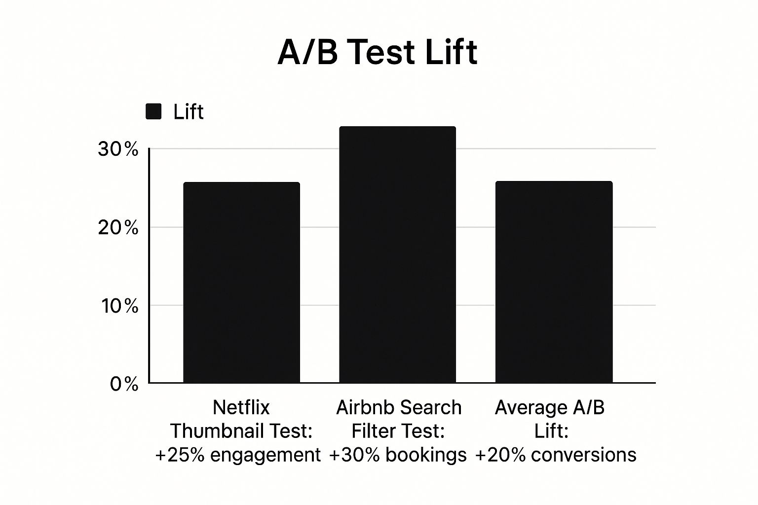
As the chart shows, the gains from disciplined testing aren’t minor tweaks; they represent substantial growth in key business metrics. For a deeper dive into applying these principles specifically to your store, you can learn more about CRO for Shopify here.
2. Mobile-First Responsive Design
In an era where most of your customers are shopping on their phones, thinking “mobile-first” is no longer an option; it’s a must-do for any serious ecommerce brand. A mobile-first approach means designing your user experience for the smallest screen first and then scaling it up to desktop. This forces you to prioritise what’s essential and create a lean, fast, and super-focused journey for the majority of your visitors.
This strategy is one of the most effective conversion rate optimisation best practices because it directly addresses how most customers now shop. By perfecting the experience on the most constrained device, you ensure a seamless, intuitive journey for everyone. Companies like Starbucks and Walmart have seen massive uplifts in mobile conversions, proving that prioritising the mobile user pays off big time.
How to Implement a Mobile-First Design Effectively
Transitioning to a mobile-first mindset involves more than just shrinking your desktop site. It’s about rethinking the entire customer journey from a mobile perspective. From our experience, this is what truly moves the needle.
- Design for Thumbs: Structure your layout so key buttons like ‘Add to Cart’ and navigation links are within the natural sweep of a user’s thumb. This makes interacting with your site feel effortless.
- Optimise for Speed: Mobile users are impatient. Compress your images, minify your code (ask your developer!), and leverage browser caching to ensure your pages load in under three seconds. Slow speeds are a primary cause of abandoned carts on mobile.
- Use Large, Touch-Friendly Targets: Make sure all buttons and clickable links are big enough to tap easily. This prevents frustrating “fat-finger” errors where users tap the wrong link.
- Simplify Forms: Long, complicated checkout forms are a conversion killer on mobile. Reduce the number of fields, use auto-fill options, and break the process into small, manageable steps.
To ensure your site performs optimally across all devices, delving into the top responsive web design best practices can be highly beneficial. Keeping up with modern UX and UI is a continuous process, and you can explore more about the latest eCommerce design trends here.
3. Clear and Compelling Call-to-Action (CTA) Optimisation
Your Call-to-Action (CTA) is arguably the most critical element on any page. It’s the final gateway between a user’s interest and a conversion, whether that’s adding an item to their basket or subscribing to a newsletter. CTA optimisation involves strategically designing and placing these buttons and links to guide users towards taking that crucial next step.
An effective CTA doesn’t just ask for a click; it persuades and motivates. It combines powerful, action-oriented language with smart design to eliminate hesitation and make the desired action feel like the natural and obvious choice. We’ve seen firsthand how a small tweak to a CTA can produce huge results, simply because it better aligns with the user’s intent. This is one of the core tenets of conversion rate optimisation best practices.

How to Implement CTA Optimisation Effectively
Getting your CTAs right requires a blend of psychology, design, and testing. It’s not about what you think looks good; it’s about what prompts your customers to act. Based on what we’ve seen work for our clients, here are some actionable tips.
- Use First-Person, Value-Driven Language: Instead of a generic “Submit,” try something that speaks from the customer’s perspective, like “Get My Free Quote.” HubSpot famously increased clicks by 202% by changing their CTA to be more personal and value-focused.
- Create Strong Visual Contrast: Your CTA button must stand out from the rest of the page. Use a bold colour that contrasts with your background but still fits your brand. Performable saw a 21% increase in conversions just by changing a button from green to red.
- Test Action-Oriented Words: The verb you use matters immensely. We recommend A/B testing different words like “Shop,” “Discover,” “Start,” or “Join” to see which one resonates most with your audience.
- Strategic Placement is Key: Your CTA should appear above the fold and at natural pause points in your content where a user might be ready to decide. Don’t make them hunt for it.
- Ensure Mobile Visibility: Your CTA must be easy to see and tap on all devices. A button that’s perfect on a desktop can be a usability nightmare on a small mobile screen.
4. Page Load Speed Optimisation
In the world of ecommerce, speed isn’t just a feature; it’s a fundamental requirement. Page load speed optimisation is the process of making your website pages load as quickly as possible. Every fraction of a second you can shave off your load time directly correlates with a better user experience, lower bounce rates, and, most importantly, higher conversion rates.
Slow-loading pages are a conversion killer. Modern online shoppers are impatient, and if your store feels sluggish, they will simply click away and buy from a competitor. This isn’t just an assumption; it’s backed by powerful data. Amazon famously calculated that every 100-millisecond delay costs them 1% in sales, and Walmart saw a 2% conversion increase for every one-second improvement. These figures show that prioritising speed is one of the highest-impact conversion rate optimisation best practices you can implement.
How to Implement Page Load Speed Optimisation
Boosting your site’s performance requires a technical focus, but the results are well worth the effort. From our experience working with Shopify stores, a few key actions consistently deliver the biggest improvements.
- Optimise Your Images: Large, uncompressed images are the most common cause of slow pages. We always recommend using modern formats like WebP where possible, as they offer excellent quality at a much smaller file size. Also, ensure you compress all JPEGs and PNGs before uploading them.
- Leverage Browser Caching: This tells visitors’ browsers to save parts of your website, like logos and code files, so they don’t have to re-download everything on their next visit. This makes return trips feel almost instant.
- Minimise HTTP Requests: Every single element on a page (images, scripts, stylesheets) requires a separate request to the server. By combining files, like merging multiple CSS files into one, you reduce the number of requests and speed up the initial load.
- Audit Regularly: Don’t treat speed as a one-time fix. Use free tools like Google’s PageSpeed Insights to regularly check your performance. This helps you identify new issues before they start hurting your sales.
5. Social Proof and Trust Signals
Humans are naturally wired to follow the crowd. This psychological principle, known as social proof, is a powerful tool in conversion rate optimisation. When potential customers see that others have purchased from you and had a positive experience, it reduces their perceived risk and builds a sense of trust that’s hard to create with marketing copy alone.
By integrating authentic social proof and clear trust signals, you’re essentially letting your happy customers do the selling for you. It’s the digital equivalent of a friend’s recommendation. This is precisely why giants like Amazon and Booking.com place customer reviews and real-time booking notifications front and centre. They leverage this collective validation to build confidence and guide new users towards a purchase.

How to Implement Social Proof and Trust Signals Effectively
Simply having reviews isn’t enough; they need to be strategically placed and presented to have the maximum impact. When we work with clients, we focus on making these signals a seamless and convincing part of the customer journey.
- Display Recent and Specific Testimonials: Vague praise like “great product” is less effective than a detailed review. Feature testimonials that mention specific benefits or solve a particular problem, and include the customer’s name and photo for added authenticity.
- Show Real-Time Activity: Use tools to display notifications like “Someone in London just bought this product.” This creates a sense of urgency and reinforces the product’s popularity, encouraging hesitant buyers to act.
- Place Trust Signals Near Conversion Points: Add security badges (like SSL certificates) and accepted payment logos (Visa, PayPal) directly on your checkout page. Placing these symbols near the ‘buy’ button can significantly reduce cart abandonment.
- Leverage User-Generated Content (UGC): Encourage customers to share photos of themselves using your products on social media. Displaying these images on your product pages is a highly authentic form of social proof that shows real people enjoying what you sell.
6. Form Optimisation and Reduction
Every online form is a potential roadblock. A long, complicated, or confusing form is one of the quickest ways to lose a potential customer, whether they’re signing up for a newsletter or trying to make a purchase. Form optimisation is the practice of systematically removing this friction to make the data collection process as painless as possible.
The goal is to get the user from start to finish with the least amount of effort. This means asking for less, guiding them clearly, and making the entire experience feel effortless. Companies that master this see huge returns. For example, Marketo saw a 34% increase in conversions by cutting their form from nine fields to five. This is a core part of conversion rate optimisation best practices because it directly impacts the final, crucial steps of the user journey.
How to Implement Form Optimisation Effectively
A well-optimised form feels intuitive and respects the user’s time. From our experience working with Shopify clients, we’ve found that even small adjustments can lead to significant gains in lead generation and sales.
- Only Ask for What’s Essential: Be ruthless. Do you really need their phone number right now? Could you get their company name later? Every field you remove is a barrier dismantled. Start with the absolute minimum required to complete the action.
- Use a Single-Column Layout: Our brains process information vertically much more easily. A single, logical column prevents the user’s eyes from darting around the page and creates a clear path to completion.
- Implement Real-Time Validation: Don’t wait until the user clicks ‘submit’ to tell them they’ve made an error. Inline validation provides instant feedback (e.g., a green tick for a correct email format) which reduces frustration and speeds up the process.
- Consider Social Logins: For account creation or lead capture forms, offering social login options (like “Sign in with Google”) can drastically reduce friction. It replaces manual typing with a single click, which is a massive win for user experience.
7. Personalisation and Dynamic Content
Moving beyond a one-size-fits-all approach, personalisation is about tailoring the customer journey to the individual. By using dynamic content, you can change your website’s messaging, offers, and product recommendations based on a user’s behaviour, location, or past purchases. This creates a more relevant and engaging experience that speaks directly to their needs.
This isn’t just a “nice-to-have” feature; it’s a core driver of revenue for the biggest names in ecommerce. Amazon’s powerful recommendation engine, which is a prime example of personalisation, is responsible for an estimated 35% of its sales. Similarly, Netflix keeps viewers hooked by personalising 80% of what they see. When you make customers feel understood, they are far more likely to convert.
How to Implement Personalisation Effectively
Getting started with personalisation doesn’t have to be overly complex. The key is to start small, gather data, and build from there. We’ve found that a phased approach delivers the best results without overwhelming your team.
- Start with Basic Segmentation: Before diving into one-to-one personalisation, group your audience into segments. You could create segments for new vs. returning visitors, high-value customers, or users who have viewed a specific product category.
- Use Progressive Profiling: Instead of asking for all customer information at once, gather it over time. Use pop-ups, quizzes, or email forms to collect data incrementally, which feels less intrusive and helps you build a richer customer profile.
- Focus on High-Impact Opportunities: Begin by personalising key touchpoints. This could be showing location-based shipping offers on the product page, displaying recently viewed items on the homepage, or creating targeted pop-ups for users abandoning their cart.
- Ensure Privacy Compliance: Always be transparent about the data you’re collecting and how you’re using it. Make sure your practices are fully compliant with regulations like GDPR to build and maintain customer trust.
Leveraging the right tools can make a huge difference in your ability to segment and personalise effectively. For a deeper look at how to use customer data for powerful, automated marketing, you can find out more about our Klaviyo expertise here.
8. Value Proposition Clarity and Testing
Your value proposition is the number one reason a customer should buy from you instead of a competitor. If it’s weak, confusing, or hidden, you’re losing sales before visitors even see your products. This crucial statement must clearly communicate the unique benefit your brand offers, answering the customer’s silent question: “What’s in it for me?”
Getting this right is a fundamental aspect of conversion rate optimisation best practices because it frames the entire user experience. A powerful value proposition, placed prominently, immediately reassures visitors they’re in the right place. Great examples include Slack’s “Where work happens,” which perfectly encapsulates its collaborative function, or Dropbox’s “Your stuff, anywhere,” highlighting accessibility and convenience. These aren’t just taglines; they are promises.
How to Implement Value Proposition Testing Effectively
Your value proposition isn’t set in stone. You need to test different messaging to discover what truly resonates with your target audience and compels them to act. A vague or feature-focused message rarely performs as well as one that speaks directly to a customer’s core needs.
- Lead with the Primary Benefit, Not Features: Customers buy outcomes, not technical specs. Instead of saying “Our shirts are made with 100% Giza cotton,” try “Experience unparalleled softness and all-day comfort.”
- Use Your Customers’ Language: Dig into reviews, surveys, and support tickets to find the exact words your customers use to describe their problems and what they love about your products. Use this language in your value proposition.
- Test on High-Impact Pages: Your homepage, product pages, and key landing pages are the best places to A/B test different value propositions. Test headlines, subheadings, and introductory paragraphs.
- Make It Specific and Quantifiable: Whenever possible, add concrete numbers. “Join 50,000+ happy customers” is more powerful than “Join our community.” Specificity builds trust and adds credibility.
- Ensure Prominent Placement: Your value proposition should be one of the first things visitors see “above the fold” without having to scroll. It needs to make an immediate impact.
9. Checkout Process Streamlining
The checkout is the final hurdle between a customer and a sale; any friction here can be fatal for conversions. Checkout process streamlining is all about removing unnecessary steps, simplifying forms, and making the payment process as smooth and reassuring as possible to combat cart abandonment.
This is critical because even minor frustrations can cause a potential customer to leave. Why ask for their mother’s maiden name when all you need is a shipping address? This is where a relentless focus on simplicity pays off. For example, ASOS reportedly saw a 50% increase in mobile conversions after reducing its checkout from five steps down to one streamlined page. It’s one of the most powerful conversion rate optimisation best practices you can implement.
How to Streamline Your Checkout Effectively
Here’s how we’d approach this with a client: map out the customer’s journey and systematically eliminate any points of friction. A complicated checkout is a guaranteed way to lose sales you’ve worked hard to win.
- Offer Guest Checkout: Forcing users to create an account is a major conversion killer. Always provide a prominent guest checkout option. We’ve seen this simple change make a huge difference for our clients.
- Display All Costs Upfront: Nobody likes surprises, especially when it comes to money. Be transparent about shipping costs, taxes, and any other fees on the cart page before the checkout begins.
- Provide Multiple Payment Options: Cater to user preferences by offering options like PayPal, Apple Pay, and Google Pay alongside standard credit card inputs. This builds trust and adds convenience.
- Reinforce Trust and Security: Display security badges (like SSL certificates) and guarantees clearly throughout the checkout process. This reassures customers that their payment information is safe.
- Optimise for Mobile: With a huge portion of traffic coming from mobile, a clunky, hard-to-navigate mobile checkout is unacceptable. Ensure fields are large, buttons are easy to tap, and the process requires minimal typing.
Conversion Rate Optimisation Best Practices Comparison
| Item | Implementation Complexity 🔄 | Resource Requirements ⚡ | Expected Outcomes 📊 | Ideal Use Cases 💡 | Key Advantages ⭐ |
|---|---|---|---|---|---|
| A/B Testing and Statistical Significance | Moderate to High due to traffic needs and analysis | Requires testing tools, analytics platforms, and traffic | Data-driven improvements in conversion rates, statistically validated | Optimising webpage elements; hypothesis testing | Eliminates bias, quantifiable results, scalable testing |
| Mobile-First Responsive Design | Moderate; requires redesign and mobile-focused approach | Design and development resources, testing on devices | Better UX for mobile users, improved SEO, higher mobile conversions | Sites with large mobile user base or mobile traffic | Future-proofing, SEO benefits, enhanced mobile usability |
| Clear and Compelling CTA Optimisation | Low to Moderate; design and wording adjustments | Minimal development resources; design and copywriting | Immediate impact on click-through and conversion rates | Improving user action on landing pages, buttons | Low cost, easy to test and iterate, direct conversion boost |
| Page Load Speed Optimisation | Moderate to High; technical expertise required | Technical resources for optimisation and maintenance | Faster load times, lower bounce rates, improved SEO and conversions | Ecommerce, content-heavy websites needing speed | Better UX, SEO, reduced server costs |
| Social Proof and Trust Signals | Low to Moderate; depends on acquisition and placement | Content creation and management, some design effort | Increased trust leads to higher conversions, reduced purchase anxiety | Building credibility in ecommerce and service sites | Cost-effective trust building, psychological influence |
| Form Optimisation and Reduction | Low to Moderate; mostly UX and development tweaks | Design and development time for form simplification | Higher form completion and conversion rates, reduced abandonment | Lead capture forms, signups | Better UX, faster conversion, mobile-friendly |
| Personalisation and Dynamic Content | High; complex data integration and content management | Advanced technology, data collection, and maintenance | Increased engagement, conversion, and customer lifetime value | Sites with rich user data and large traffic | Competitive advantage, highly relevant user experiences |
| Value Proposition Clarity and Testing | Moderate; strategic messaging and testing required | Marketing and copywriting efforts, A/B testing | Clear communication leads to better-qualified leads and higher conversions | Landing pages, new product introductions | Better message clarity, competitive differentiation |
| Checkout Process Streamlining | Moderate to High; involves multiple systems integration | Development and UX resources, payment gateway integration | Reduced cart abandonment, increased purchase completions | Ecommerce checkout flows | Higher revenue, better UX, reduced friction |
Start Small, Win Big: Your CRO Journey Starts Now
We’ve just covered a huge amount of ground, from the statistical rigour of A/B testing to the psychological power of social proof. It can feel like a mountain to climb, especially when you’re already juggling a dozen other tasks to keep your ecommerce store running. But here’s the most important takeaway: you don’t need to do everything at once. In fact, you absolutely shouldn’t.
The journey to a higher conversion rate is built on small, deliberate, and consistent steps. It’s about building a culture of continuous improvement, not launching a one-off, dramatic overhaul. Real, sustainable growth comes from isolating a problem, hypothesising a solution, testing it methodically, and then learning from the results, win or lose. This is the core loop of conversion rate optimisation.
Recapping Your CRO Toolkit
Let’s quickly crystallise the key principles we’ve explored. These are the foundational conversion rate optimisation best practices that form the bedrock of any successful strategy:
- Test with Purpose: Don’t just guess. Use A/B testing to validate your ideas with real user data, ensuring you’re making changes that genuinely improve performance, not just changes you think will work.
- Think Mobile-First: Your customers are on their phones. Designing for the smallest screen first isn’t a trend; it’s a commercial necessity for a seamless user experience that converts.
- Guide the User: Your CTAs are the signposts on your customer’s journey. Make them clear, compelling, and impossible to miss. They should answer the user’s silent question: “What do I do next?”
- Speed is a Feature: A slow website kills conversions. Optimising page load speed is a non-negotiable technical task that has a direct and measurable impact on your bottom line.
- Build Unshakeable Trust: From customer reviews to security badges, social proof and trust signals are your greatest allies in overcoming visitor hesitation and turning browsers into buyers.
- Simplify to Succeed: Every field in a form, every step in a checkout, is a potential point of friction. Ruthlessly streamline your checkout and optimise your forms to make purchasing effortless.
- Make it Personal: Generic experiences get ignored. Use personalisation to show customers you understand their needs, presenting them with the right products and offers at the right time.
Your Actionable Next Step: The One-Thing Focus
So, where do you begin? The answer is simpler than you think. Pick one thing.
Don’t try to optimise your homepage, product pages, and cart all at the same time. That’s a recipe for confusing data and burnout. Instead, look through this list and identify the single biggest opportunity for your store right now.
Maybe you’ve noticed a high drop-off rate on your checkout page. Your “one thing” is to focus solely on streamlining that process. Perhaps your mobile bounce rate is sky-high. Your “one thing” is to dive into your mobile user experience. Pick the area that feels like the lowest-hanging fruit or the most painful bottleneck and commit to improving it.
This is exactly how we approach it with our clients at Digital Fresh. We start with a deep dive to identify the single most impactful area for improvement. We then build a testing plan around that one area, measure the results, and use the learnings to inform the next focused test. It’s an iterative cycle of small wins that compound into significant, long-term growth.
This methodical, focused approach transforms CRO from an overwhelming concept into a manageable, measurable, and even exciting process. Every test is a learning opportunity, and every small improvement is a step toward a more efficient, profitable, and customer-centric business. Your journey into mastering conversion rate optimisation best practices starts not with a giant leap, but with a single, confident step forward.
Feeling overwhelmed or unsure where to start? We get it. At Digital Fresh, we live and breathe Shopify CRO, turning data-driven insights into real revenue for our clients. If you’re ready to get serious about optimising your store with a team of experts in your corner, let’s have a chat. We can help you identify that “one thing” and build a roadmap for sustained growth. Find out more at Digital Fresh.